VIVEK SAIGAL

QuickBooks Design Systems Strategy

  • FOR
  • ROLE
  • TEAM
  • Intuit QuickBooks
  • Design Systems
  • UX Researcher
    Content Strategist

How much did it cost to code this table?

320 hours to code
$96/hr is average developer’s salary
=$30,270 to build one table

85 custom tables variations in product
$30,720 x 85 versions:

$2,611,200

for custom component in dev labor alone
visual design of an accounting table component

Upfront summary

Customer problem

QuickBooks had a messy design system that was causing confusion, slowing down hundreds of developers and designers, and costing money. 

Business needs

A consistent and scalable design system allows designers and developers to focus on building and shipping for our customers. They don’t waste time and money designing one off components.

Goal

Treat our design system as a product. To know our next steps and see if we’re succeeding, we first need to understand where we are now. Identify usefulness and pain points!

Outcome

We gathered research to measure the health of our design system and understand where we are now. We used data to influence initiatives for simplifying and standardizing... which made everything more consistent and easier to manage. ↓

Problem we were solving

Hundreds of developers and designers rely on the QuickBooks design system to solve customer problems quickly. It needs to be strong, consistent, and scalable across platforms.

Nothing about 85 tables was strong, consistent, or scalable.

On the surface, we needed to replace 85 versions of the same table with a standard system component.

But below the surface, the table was just one example of a larger problem with our design system.

We interviewed 6 developers and 7 designers across 3 teams...

What we learned

We have too many custom components. They take longer to build and create visual inconsistencies.

50-100

custom designs exist per scrum team.

8,000

legacy components are still in use due to poor documentation and tracking.

43%

of designs in QuickBooks use legacy components.

Developers and designers don’t know which design system to use.

There’s inconsistent or nonexistent onboarding and education.

Missing documentation delays decisions for designers and developers.

Designers and developers often spend weeks searching for information and agreeing on designs, delaying customer delivery.

What we did

Ultimately, our findings made it clear that systems-based work is a priority. Here are some of the projects that spun out of the research.

Many projects spun out of our research! Here’s some of the work I did.

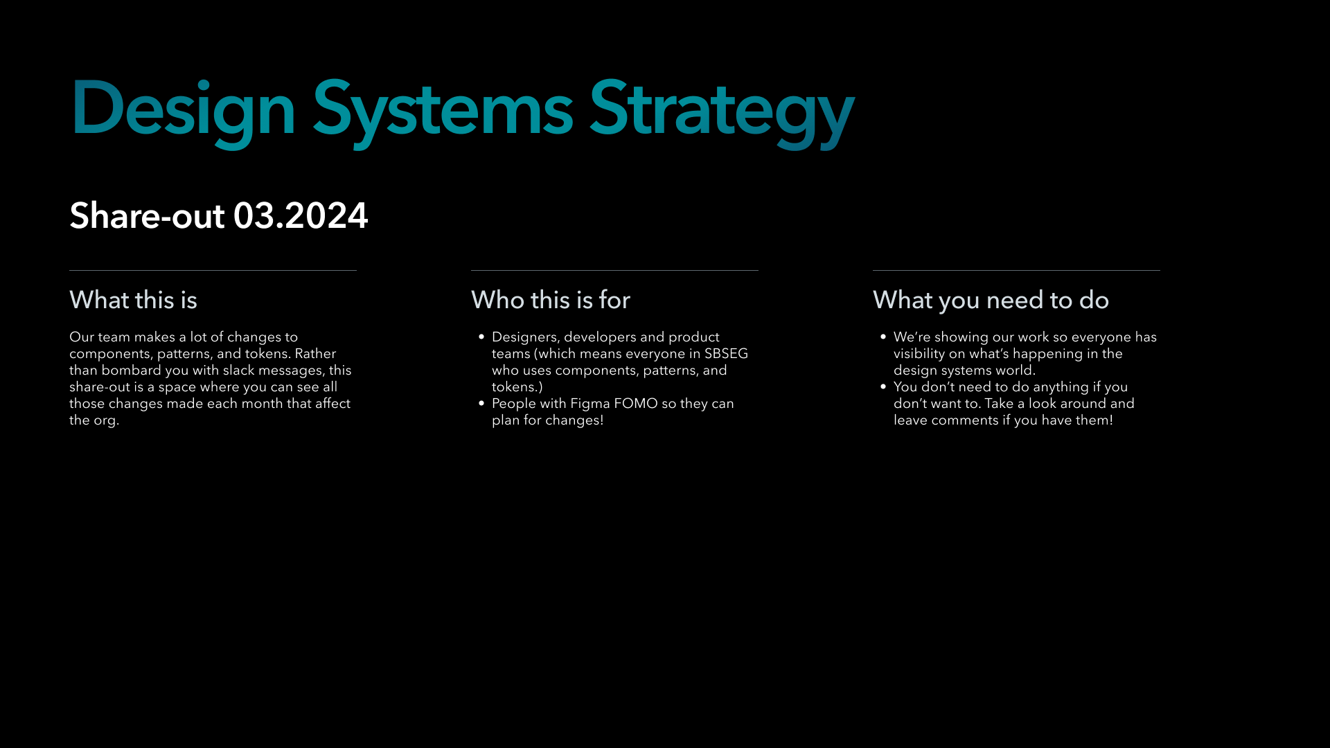
Monthly Share-out Figma Gallery

Goal

Give designers, developers and product teams visibility on what’s happening in the systems world.

What we did

Shared a monthly Figma gallery for the community to see all the changes to patterns, components, and tokens.

This replaces the endless slack and email updates which get missed and are hard to find.

Design Systems Strategy Share-out slide for March 2024

Share-out cover page

Date picker design component slide

Component update

Design Tokens Figma Cheat Sheet

Goal

Help designers understand tokens and apply the correct tokens to their designs by answering the most common questions.

What we did

We created a quick-start cheat sheet in Figma for designers to access the most common design tokens used in QuickBooks.

This reinforces good design habits and reduces cognitive load and errors.

cheat sheet for common UI elements and the correct design tokens to use

Making it easy for designers to use the correct tokens in Figma.

Design Tokens Linter

Goal

Help designers to apply the correct tokens in their Figma designs.

What we did

I contributed visual and interaction design to a Figma Plugin that could review a Figma page, and flag correct or incorrect use of design tokens.

This was a one week “Engineering Days” project where I stepped in to help my developer teammates.

visual design for two screens of a Figma plugin that detects incorrect design tokens

Home and set up (left) and scan results (right).

In-Product Discovery Figma Components

Goal

Improve In-product Discovery for our customers by providing consistency across marketing and product experiences.

What we did

We audited patterns for performance, visual style, accessibility, and usability. Then, we partnered with the Intuit Design System to build a component library for use across product and marketing experiences. We used design tokens to support theming and documented guidelines for each component.

visual design of tool tip Figma component and several variations

Tool tip component and it’s many variants.

Lessons learned

With everything I do, there’s always room for improvement. If I could do it over, I would’ve sent a quarterly survey to designers and developers. This would’ve helped us understand if our efforts were improving the design system and what more needed to be done.

Priorities shift and I get pulled into new projects, but that’s no excuse. I would’ve made the survey a requirement of the project.

Oh, and about that table...

There was a big effort to redesign and develop a new data grid. The goal was to replace and modernize the 85 different table variations in QuickBooks using design tokens.

While I wasn’t personally involved, it was comforting that code and design were finally consistent.

And there was one table to rule them all.