Creating order from chaos—redesigning the QuickBooks dashboard
Planning, patience, patterns, and partners
Dashboard widget explorations
VIVEK SAIGAL
Dashboard widget explorations
Customer problem
Small business owners say that the QuickBooks homepage dashboard is cluttered with irrelevant information and actions that aren’t tailored to their needs. They can’t find the workflows to get set up and run their business quickly.
Business needs
Tailor the QuickBooks experience to convert trial users into loyal subscribers. Attract a younger audience to secure future growth.
Goal
Help customers set up and run their business more efficiently with a personalized dashboard tailored to their needs.
Outcome
We created a framework based on reusable components to keep all QuickBooks dashboards consistent. We removed visual clutter and grouped similar content into clear sections. Important information was highlighted and less relevant details were minimized. ↓
Data showed that the cluttered QuickBooks dashboards makes it hard for customers to be productive and manage their business.
Customers even compared the friction of using the dashboard to an “act of Congress.”
To understand the problem and find opportunities, we audited the 9 QuickBooks overview dashboards.
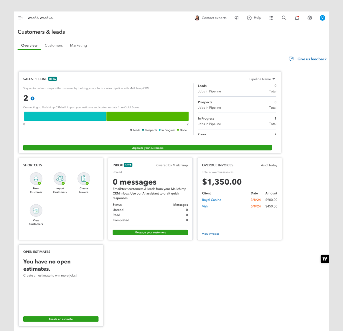
Customer & Leads Overview
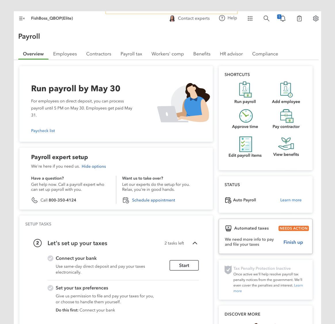
Payroll Overview
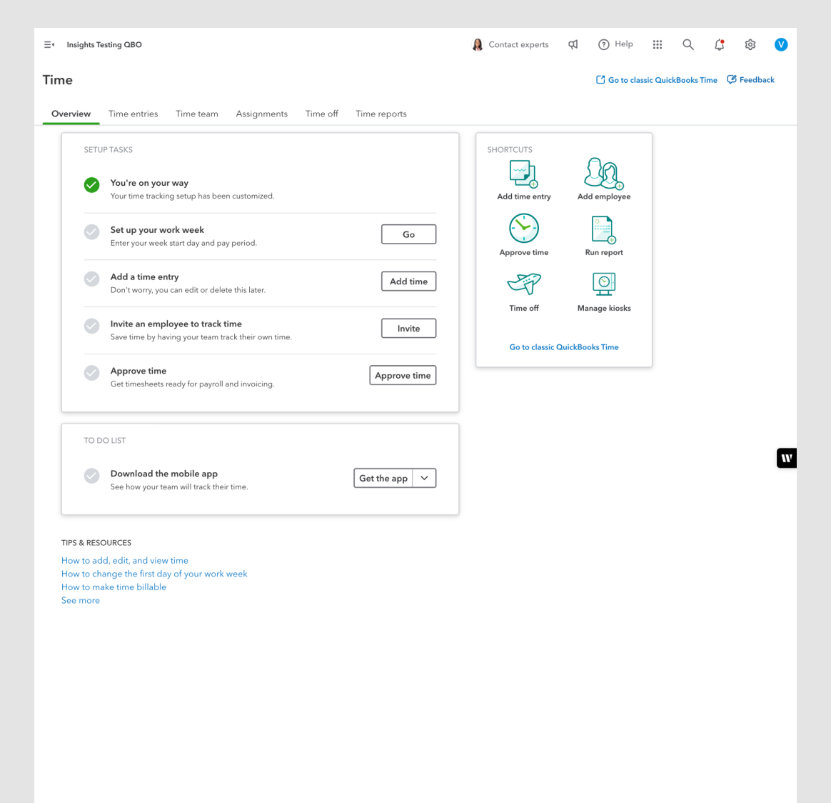
Time Overview
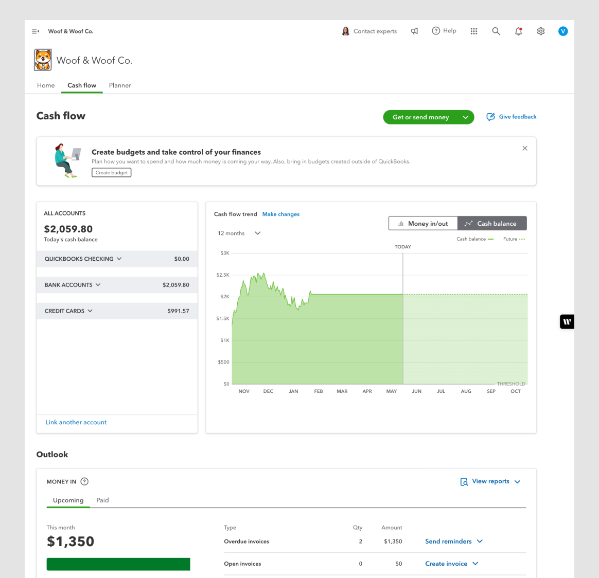
Cashflow Overview
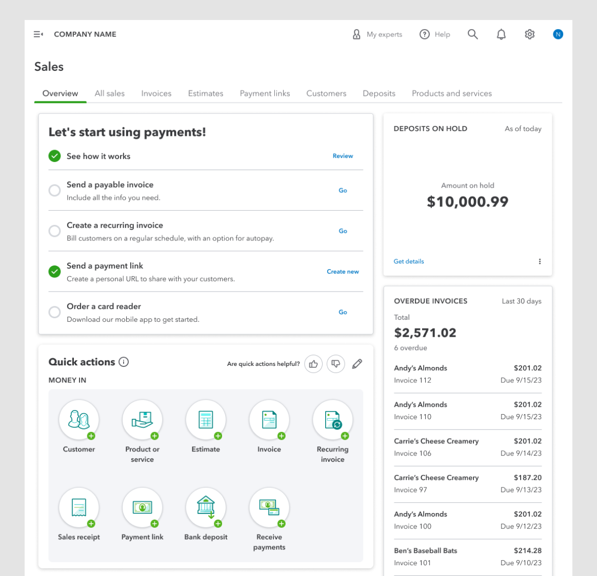
Sales Overview
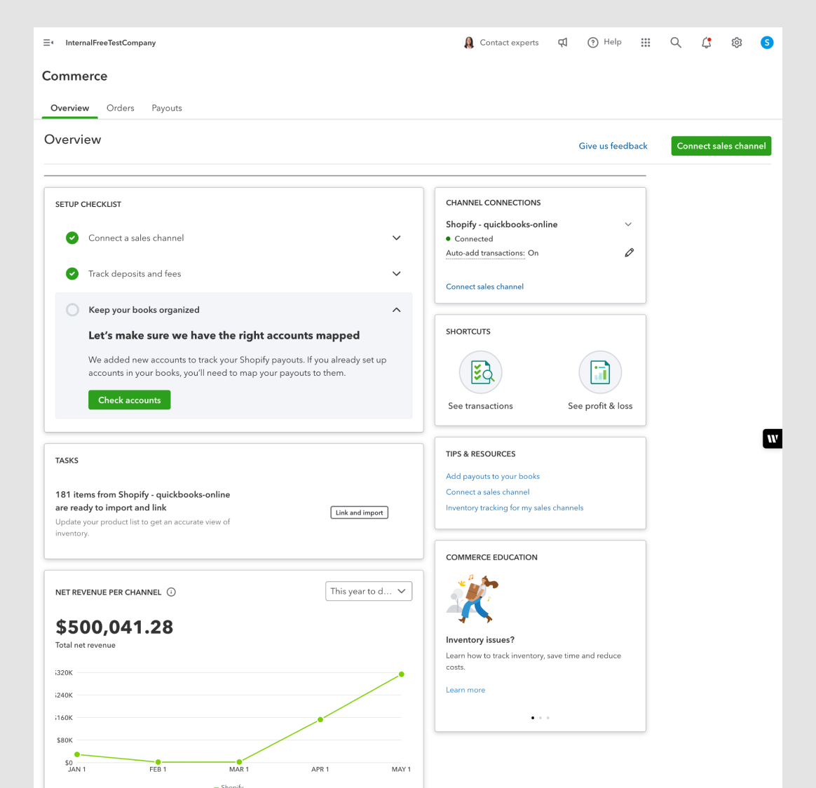
Commerce Overview
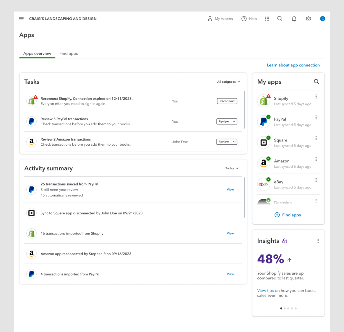
Apps Overview
Solopreneur Overview
QBO Core Overview
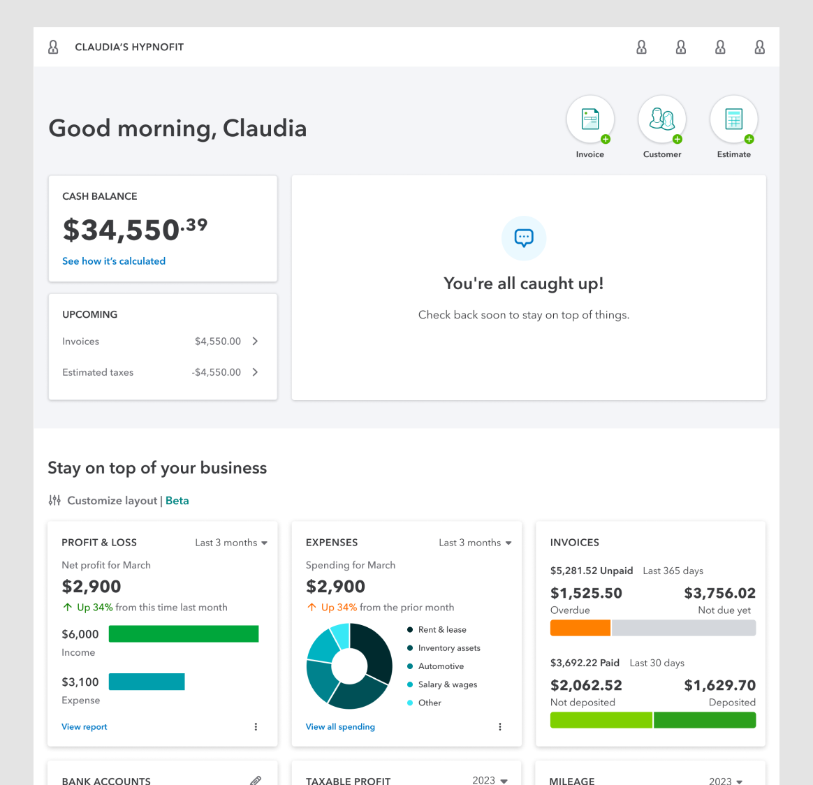
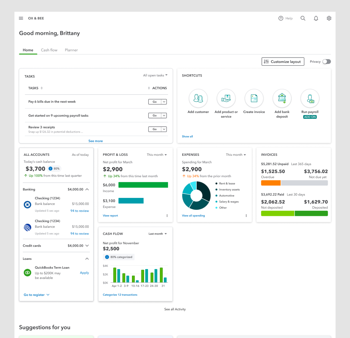
Inconsistent page layout
The column structure and grid are never the same.
Inconsistent content
“Task” list versus “To Do” list. “Shortcuts” versus “Quick Actions.” This kind of inconsistency increases the cognitive load on the customer.
Inconsistent visuals
Icons were inconsistent—some were free-floating, others in circles, and they varied in size. Illustrations felt random and unrelated to the content. Typography lacked uniform color, weight, and size. Using the same colors for data visualizations and UI components caused confusion.
No hierarchy
At a glance, the dashboard widgets all look the same. If everything on the screen is important, nothing is important. We're not giving the customer any hints about how to use this dashboard.
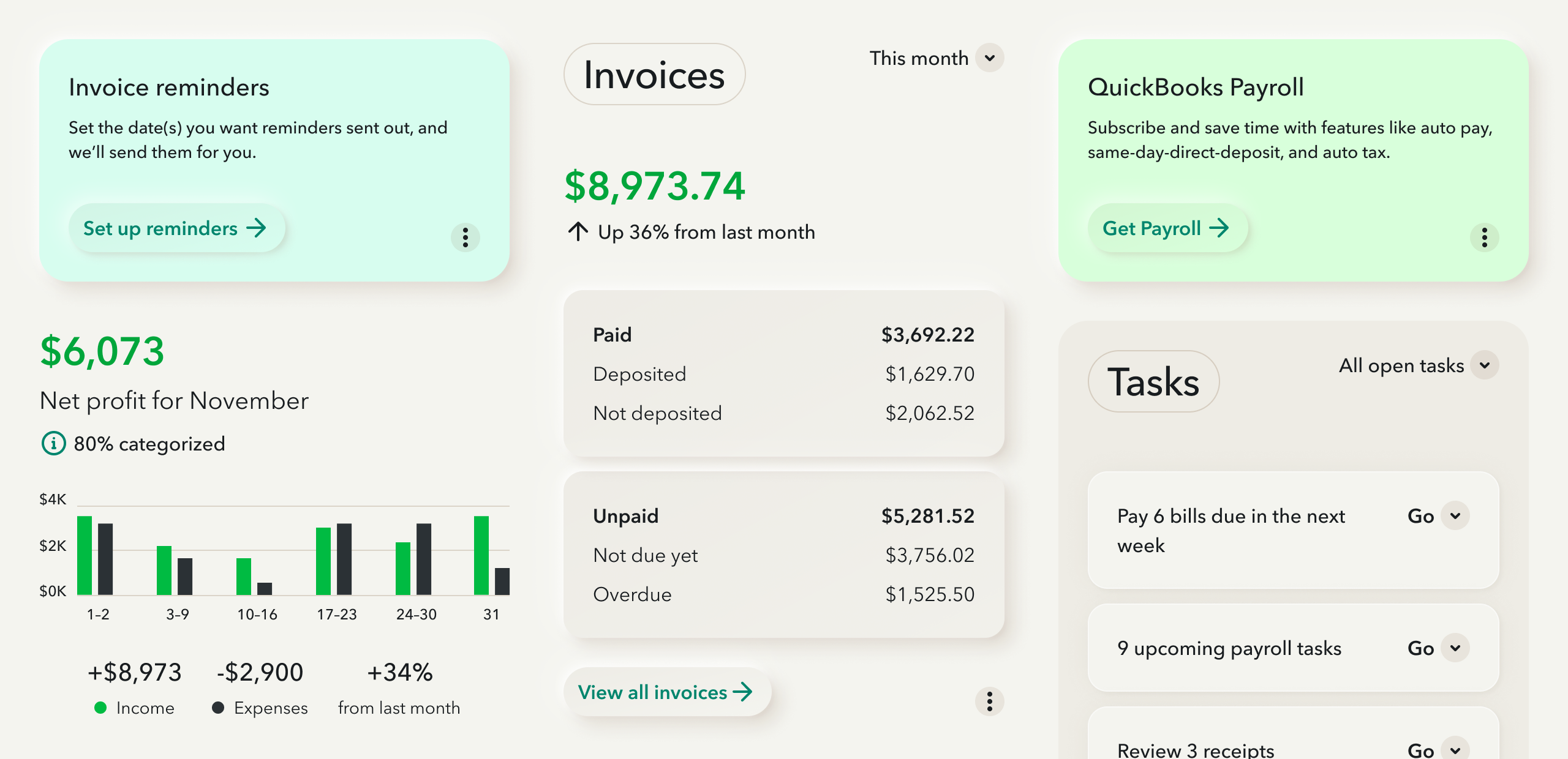
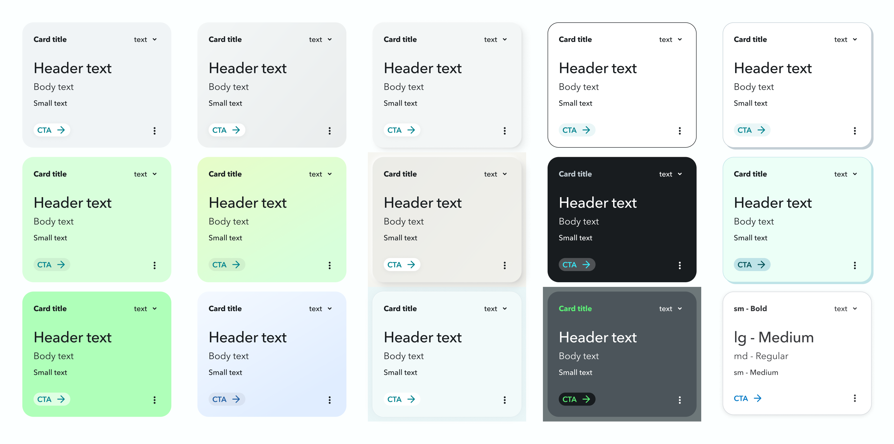
NNG defines widgets and cards as “compressed views” and “snapshot-like displays.”
We used this guiding principle to do a deeper audit on the dashboard’s main element: the card widgets.
We grouped all widgets from all dashboards into categories.
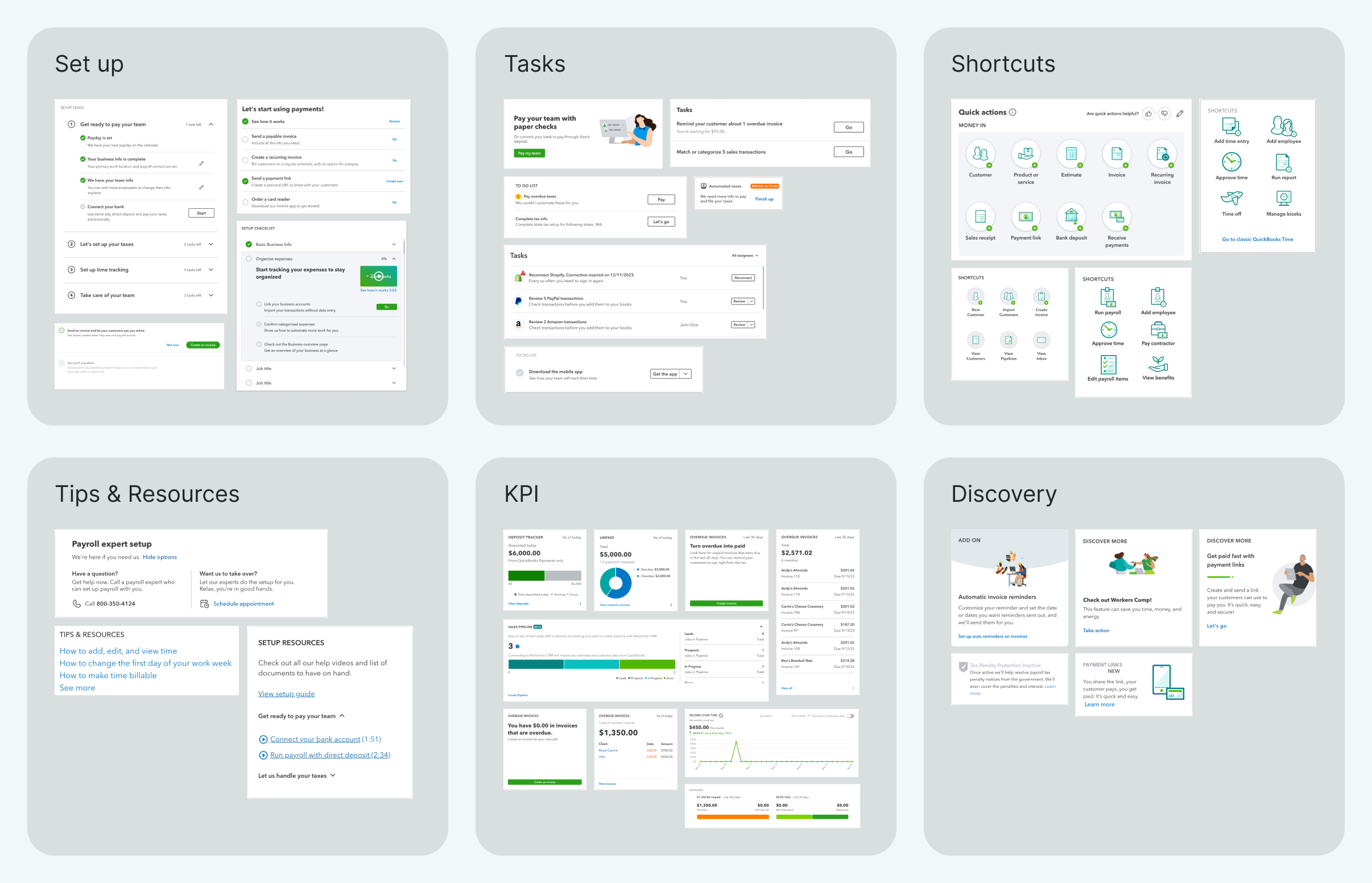
Selections from set up, tasks, shortcuts, tips & resources, KPI and discovery widgets.
In each widget category, we looked for opportunities for consistent structure, behavior and design.
We documented all common UI components and made a requirements list.
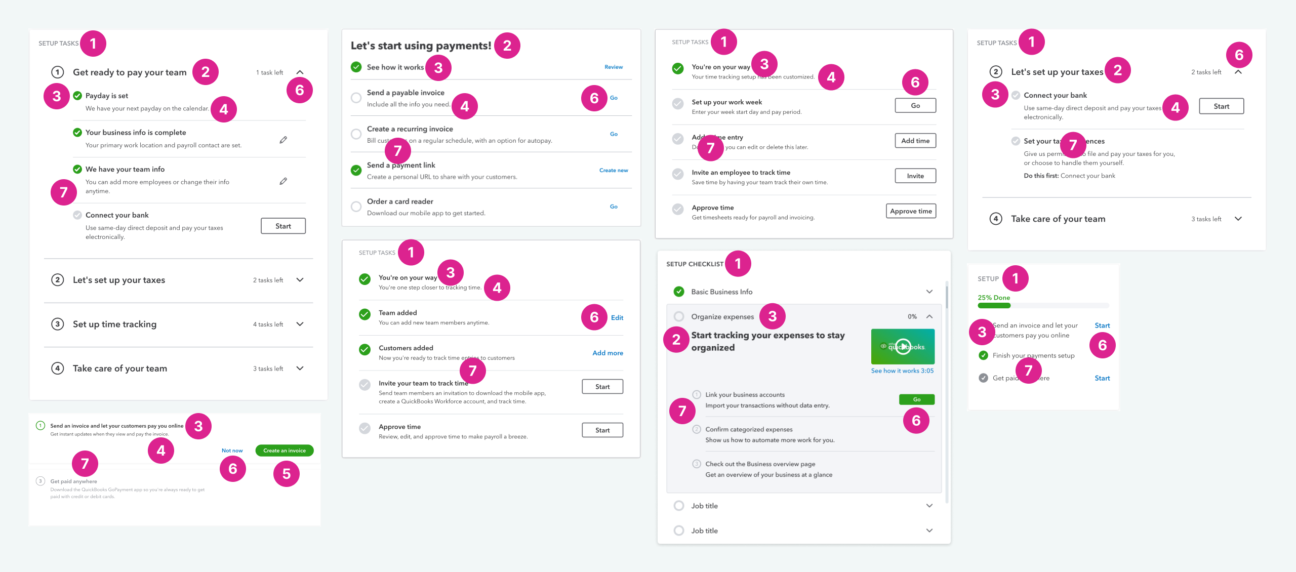
1. title, 2. header, 3. body, 4. body small, 5. primary CTA, 6. secondary CTA, 7. data table
We used the requirements lists to combine all the different widgets into a single, scalable, component.
Note: reconsidering our data visualization, product illustration and iconography were not in scope for this project. Each would require it’s own separate effort.

Main widget component and a few data table examples
In parallel, I explored visual methods to show relationships and differences between widgets.
We all agreed on two things: reaching our ideal state would take time, and that our customers couldn’t wait.
To remove pain points and provide value quickly, we phased the design delivery:
Version zero - done in a few weeks
Good - done in 3 months
Better - done in 6-8 months
Best - done in 12-18 months
Our designs weren’t meant to prescribe solutions. They were to start conversations about possibilities.
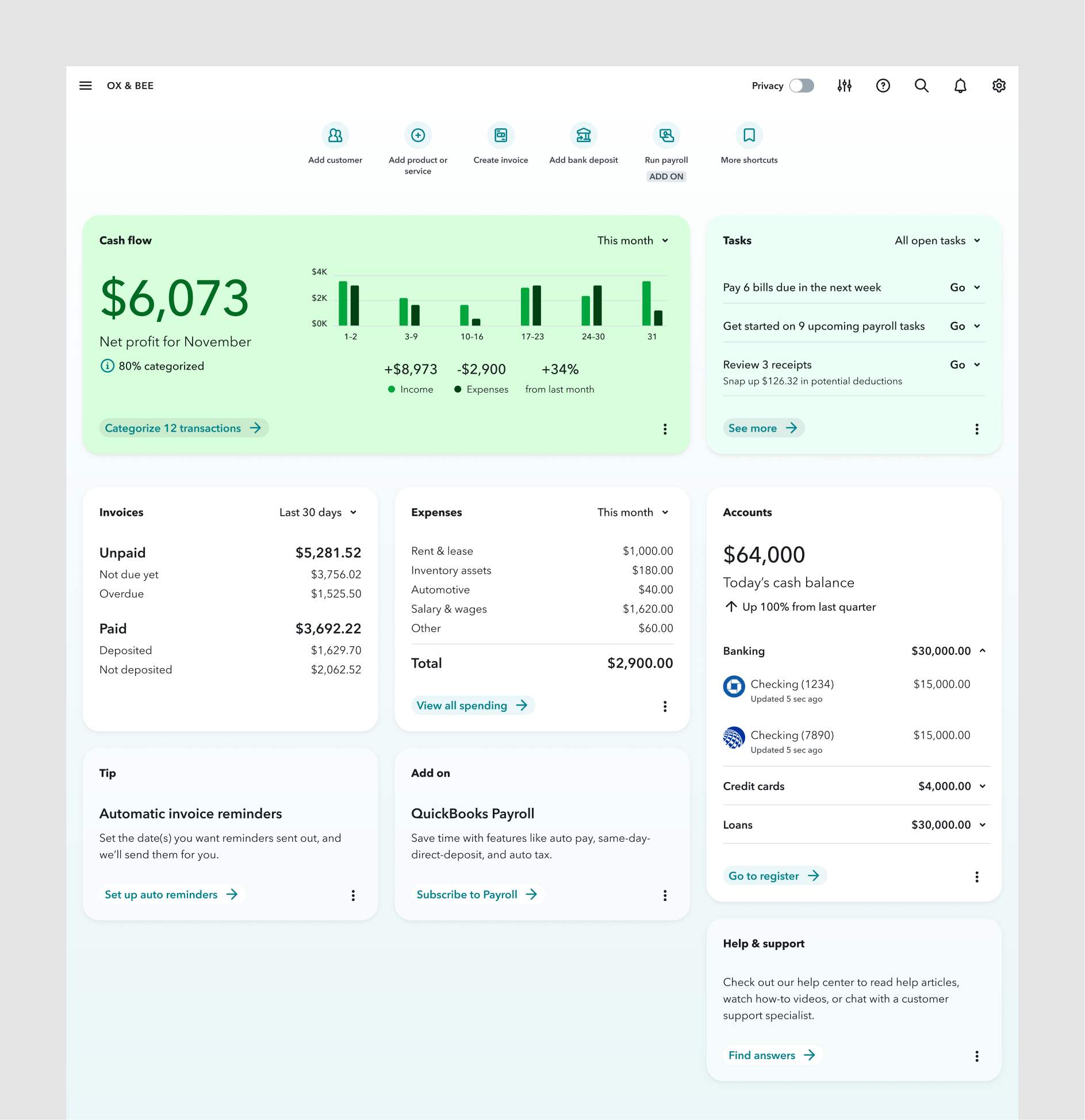
To create clearer hierarchy, we grouped similar widgets into sections. We collaborated with engineers to develop a consistent layout.

Before

After
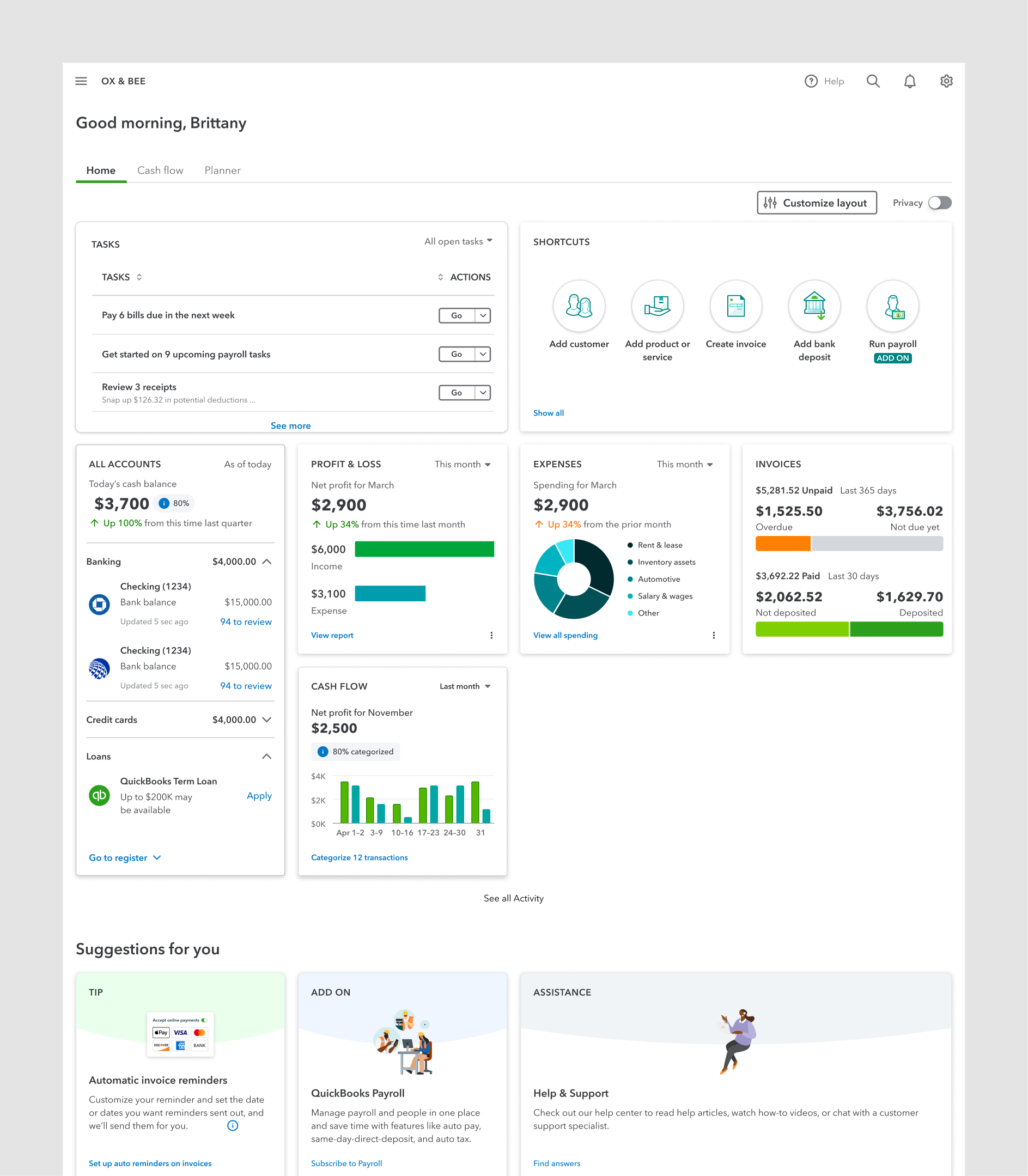
Version: Zero
We applied our new card component and hierarchy framework. We removed cluttered data viz and unnecessary illustrations.
Though far from our ideal state, we felt confident that we were addressing customer pain points.
Before
After
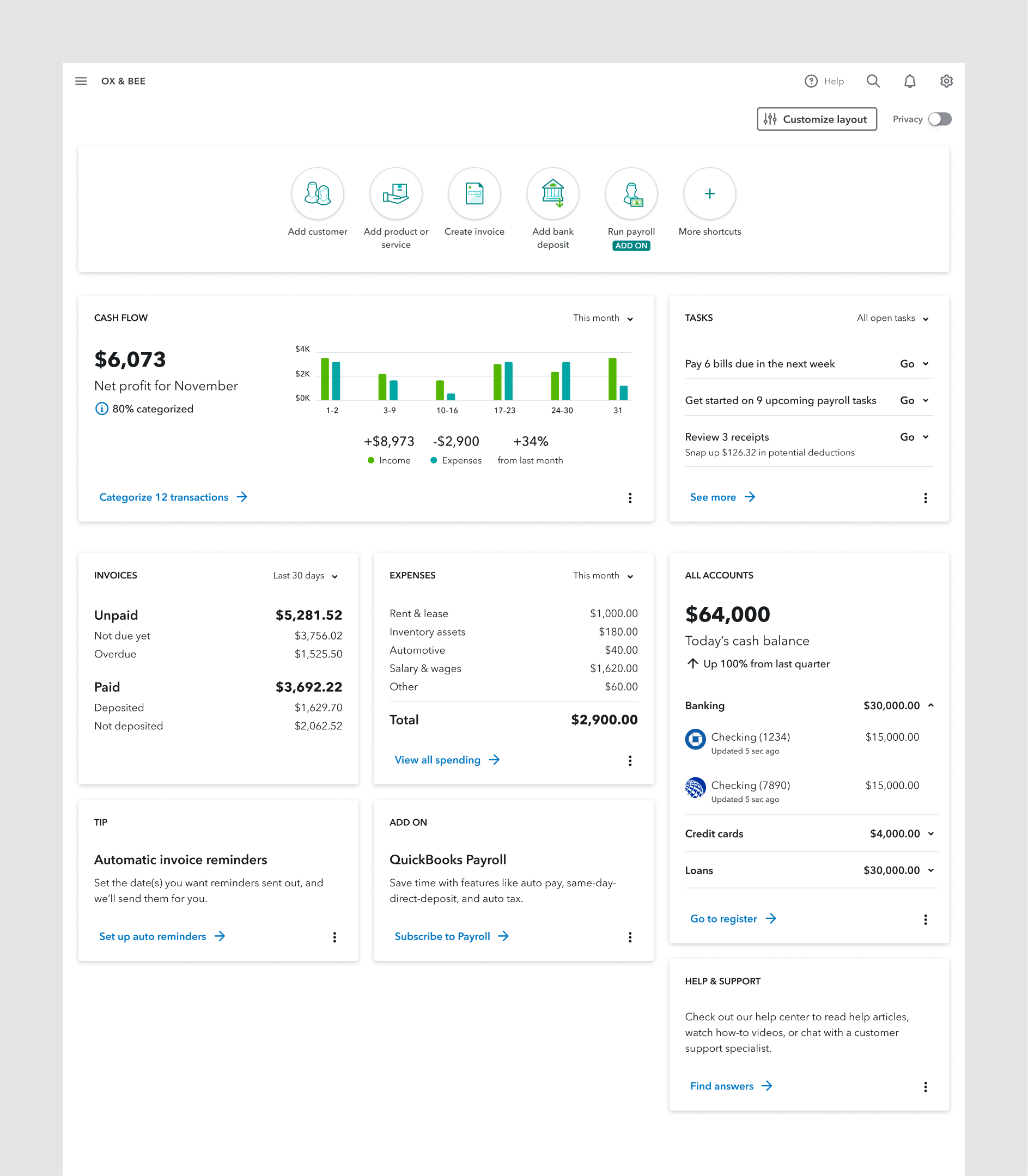
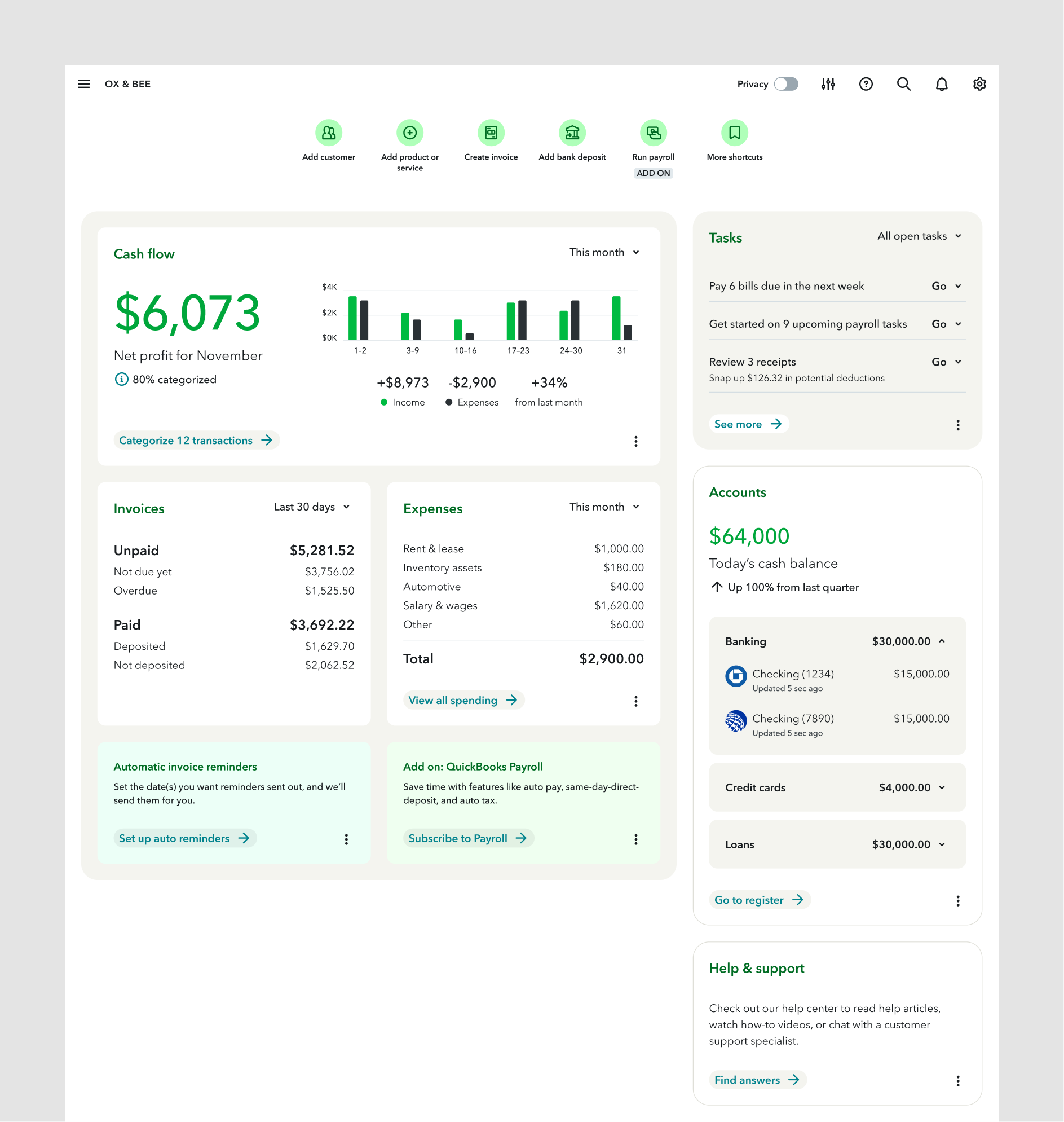
Version: Good
We used our new color palette to make sections stand out more. Icons were updated, typography refined, and the remaining illustrations were removed.
Exploration 1
Exploration 2
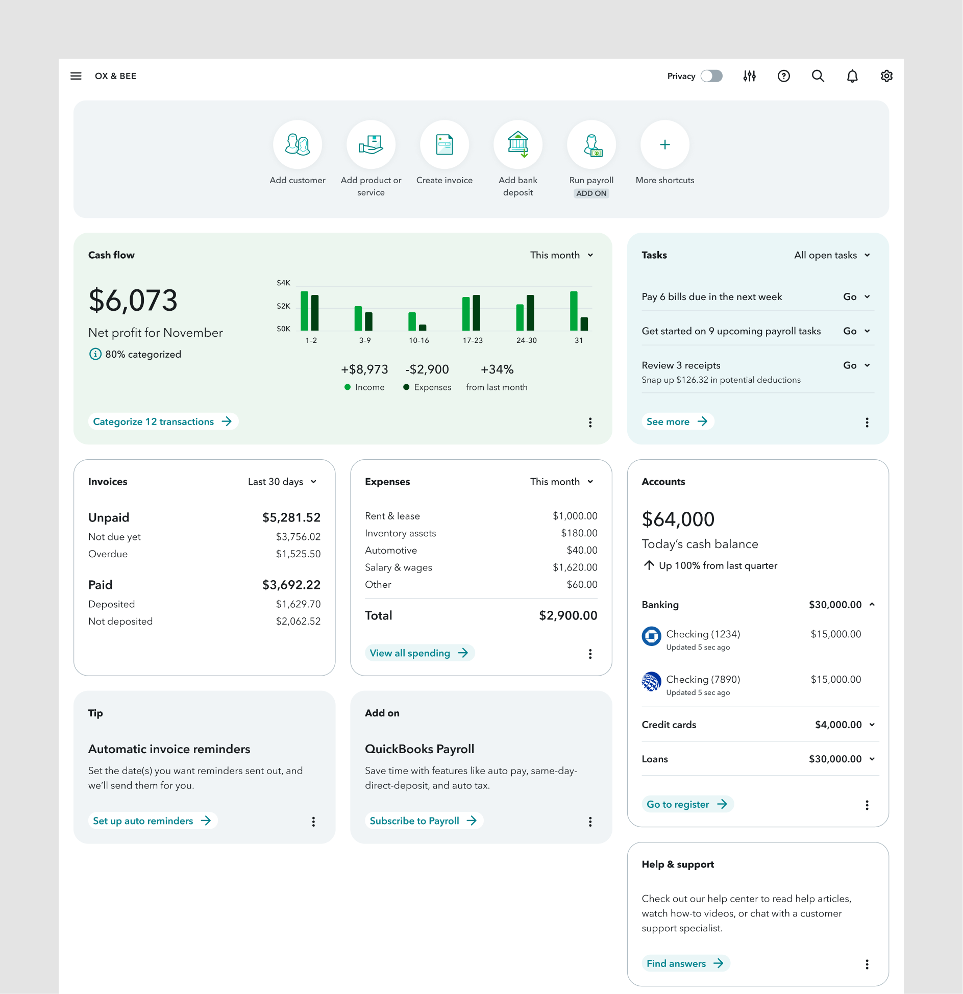
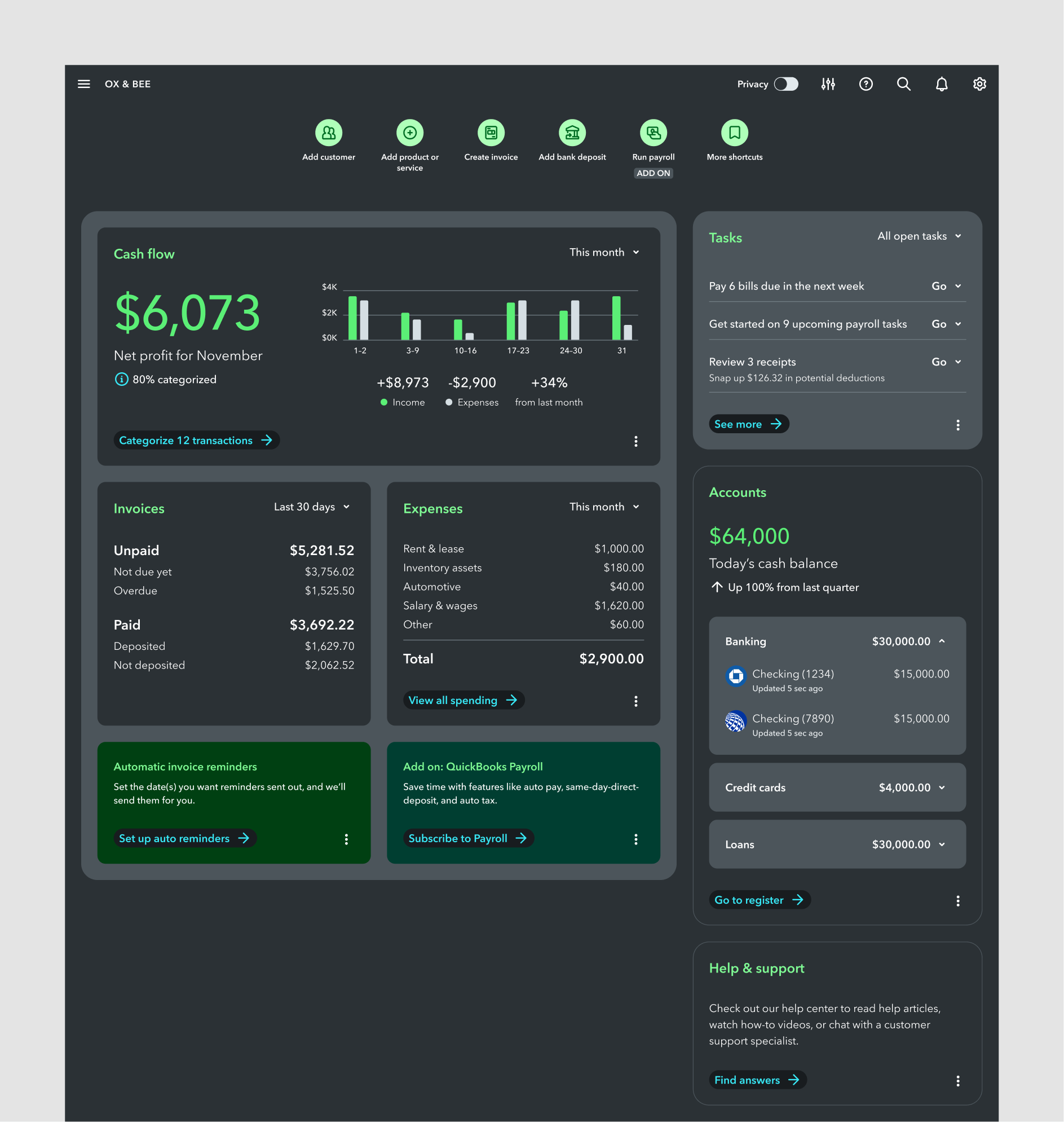
Version: Better
We chose a limited color palette of warm tones to better group similar content. With this framework set up, we pressure tested our color tokens on a highly requested feature: dark mode.
Exploration 1
Exploration 2
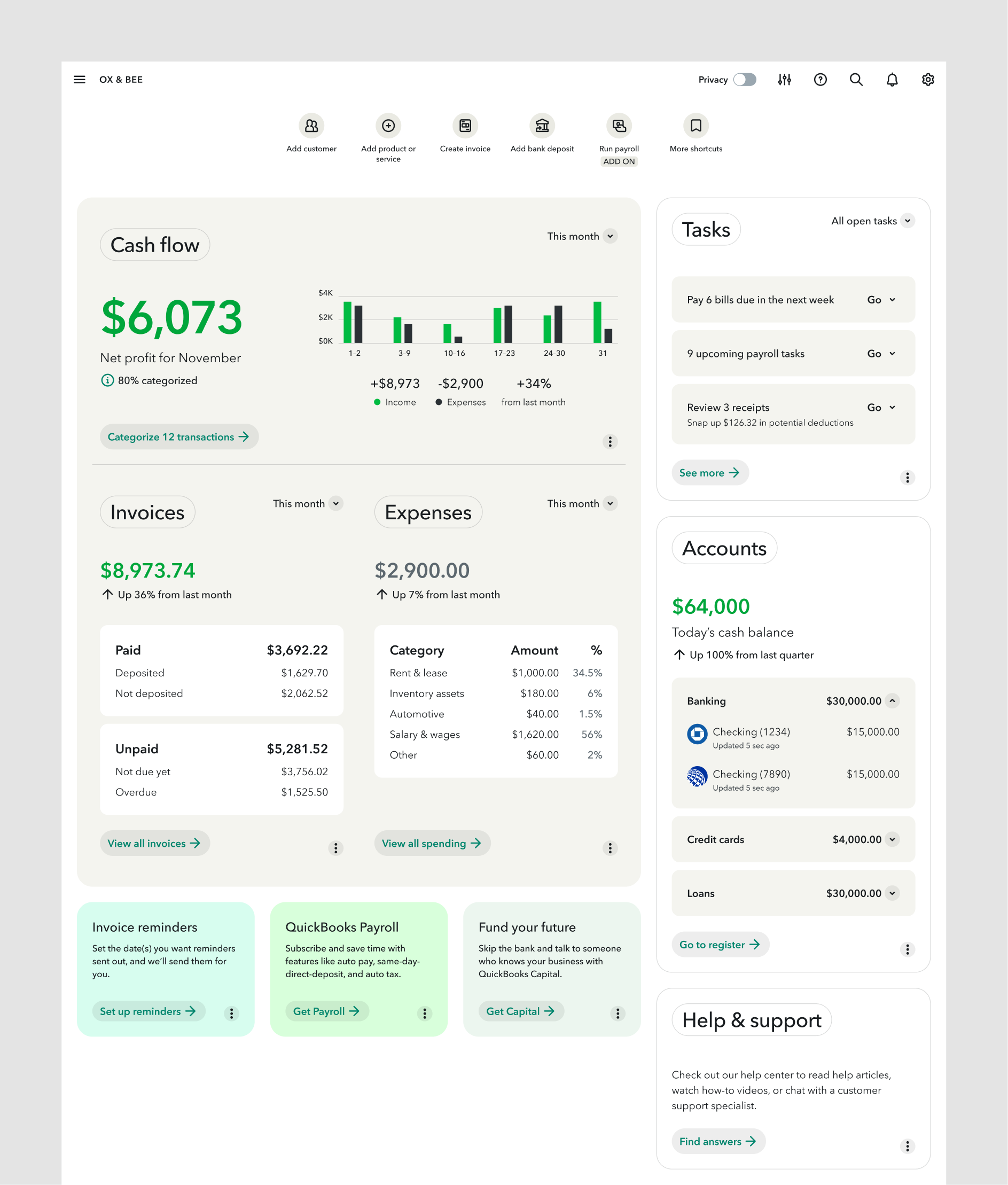
Version: Best
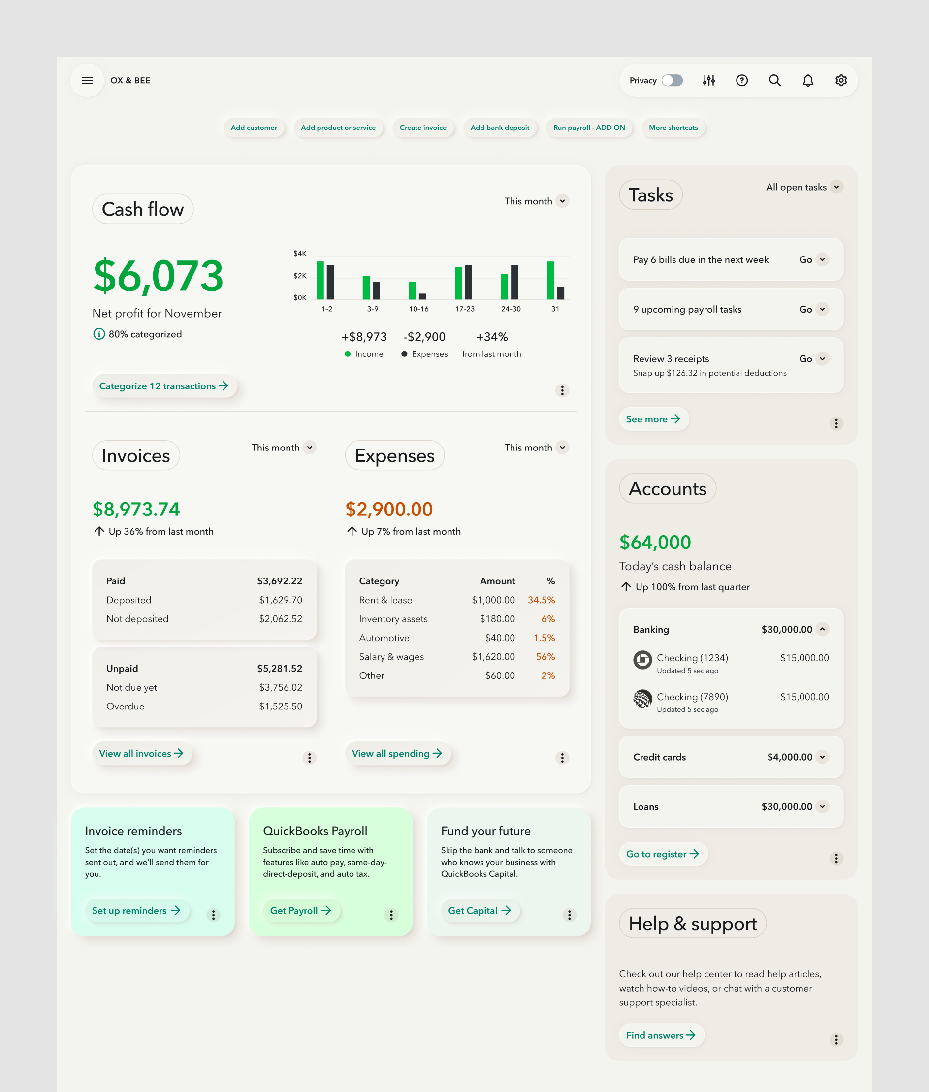
We strengthened visual links between Cash Flow, Invoices, and Expenses. Titles and the totals got larger text, and tips and add-ons got their own section.
We also explored the bold style of Neumorphism. While it’s polarizing, it pushed our design language further—small changes only bring small results!
Exploration 1
Exploration 2
Widget component variants
As we designed the dashboard, we expanded the library of widget variants. This was our initial proposal and it needed ongoing testing and collaboration with other product teams.
We wanted to build a framework so durable, so flexible, that nobody would ever "detach instance.”

Initial widget variants
The immediate goal was to test our new framework with all dashboard teams and customers to ensure it met their needs.
The visual directions we explored would affect all of QuickBooks. To move forward, we needed to collaborate with other product teams, engineering, and leadership.
Future goals would allow customers to move widgets between sections for a truly personalized experience.
My biggest takeaway from this work? Long-term planning gets people excited about the journey.
By introducing changes in phases, we kept teammates and leadership on board. Partners never felt blindsided, and were able to provide healthy feedback.
A welcome side effect of this incremental evolution was that the customer's experience would improve, gradually. We never moved their cheese.
Our proposal didn’t dictate solutions; it sparked ideas and excitement about what’s possible for QuickBooks.