QuickBooks Invoicing
Why weren't invoices getting paid?
- For
- Intuit QuickBooks
- Role
- Senior Visual Designer
- Team
- Content Designers
- Product Designers
- Product Managers
- Developers
Overview
I was the visual designer on QuickBooks invoicing for almost five years. These are three projects from 2018 and 2019.
Problem
QuickBooks invoices were built for recording money, not getting paid.
Why it mattered
Small businesses run on cash flow. Every late payment hurts.
Goal
Help small businesses get paid faster.
Outcome
Invoicing grew 9x in two years, and the payment tracker earned two design patents.
The problem
QuickBooks invoicing was built from an accountant's point of view, not the business owner's.
Owners couldn't see where their money was. Most invoices couldn't take a payment, so owners got paid through other services and used QuickBooks just to keep records. And the invoice was one-size-fits-all, no matter whose business sent it.
What we found
Talking with customers showed what was behind each problem.
A status wasn't enough. "Viewed" or "Deposit failed" didn't say when the money would arrive or what to do next.
Payments were hard to find. Invoices paid online got paid 3x faster, but only 7% of invoices sent could take a payment. Payments was a separate add-on, and customers who wanted it couldn't find it.
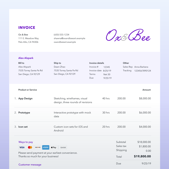
Looks mattered. Professional-looking invoices were more likely to be paid. Owners wanted their invoices to look like their business, without designing one from scratch.
What we did
Payment tracker
Leadership wanted to keep the old horizontal tracker. I had a feeling it wouldn't fix what customers told us. Then our product manager suggested testing it in German and Portuguese, and the longer words got cut off.
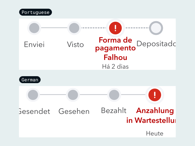
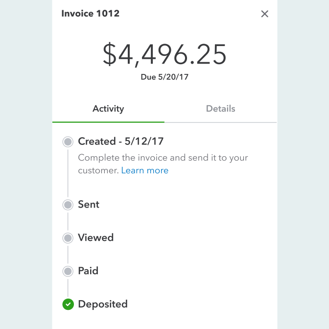
So I turned it 90 degrees. Each step got its own line, with room for longer words and details like dates, late fees and partial payments.
Payments setup
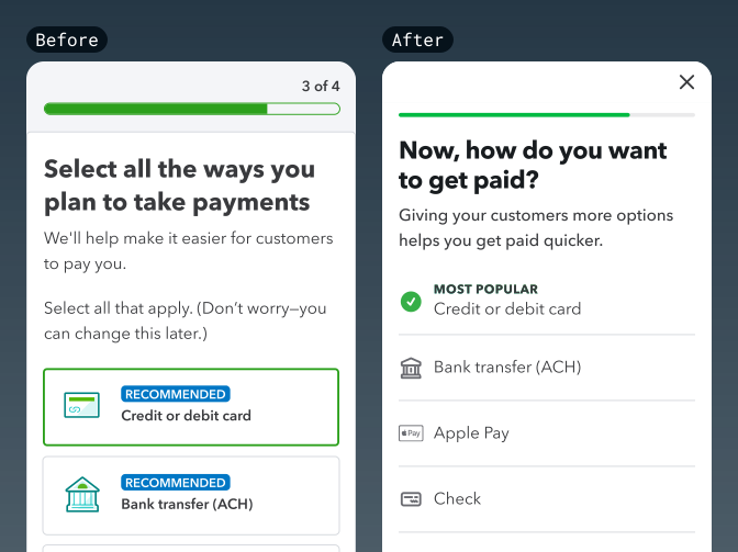
Payments moved to the start: when owners set up their first invoice, they also chose how they wanted to get paid.
Our design system's patterns added up to a lot of noise. Everything sat in a card, next to illustrations nobody needed and a step indicator never designed for mobile. So I cut what distracted from the task, and the content designer did the same for the words and the flow.
Invoice customization
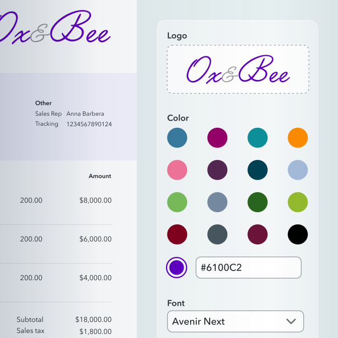
A template gave owners a starting point. From there they could pick colors and add their logo, and the invoice worked online, on mobile, and in print.
Results
9x growth
in customers using invoices in just two years
July 2022
175,000
customers a month using invoices
July 2024
1,600,000
customers a month using invoices
The team credited customization for the jump.
Payments setup shipped in May 2019. The payment tracker took longer: another team built it after I left, and it earned me two design patents (D915420 (design patent, opens in a new tab) and D986257 (design patent, opens in a new tab)).
Happy ending, right? Not quite
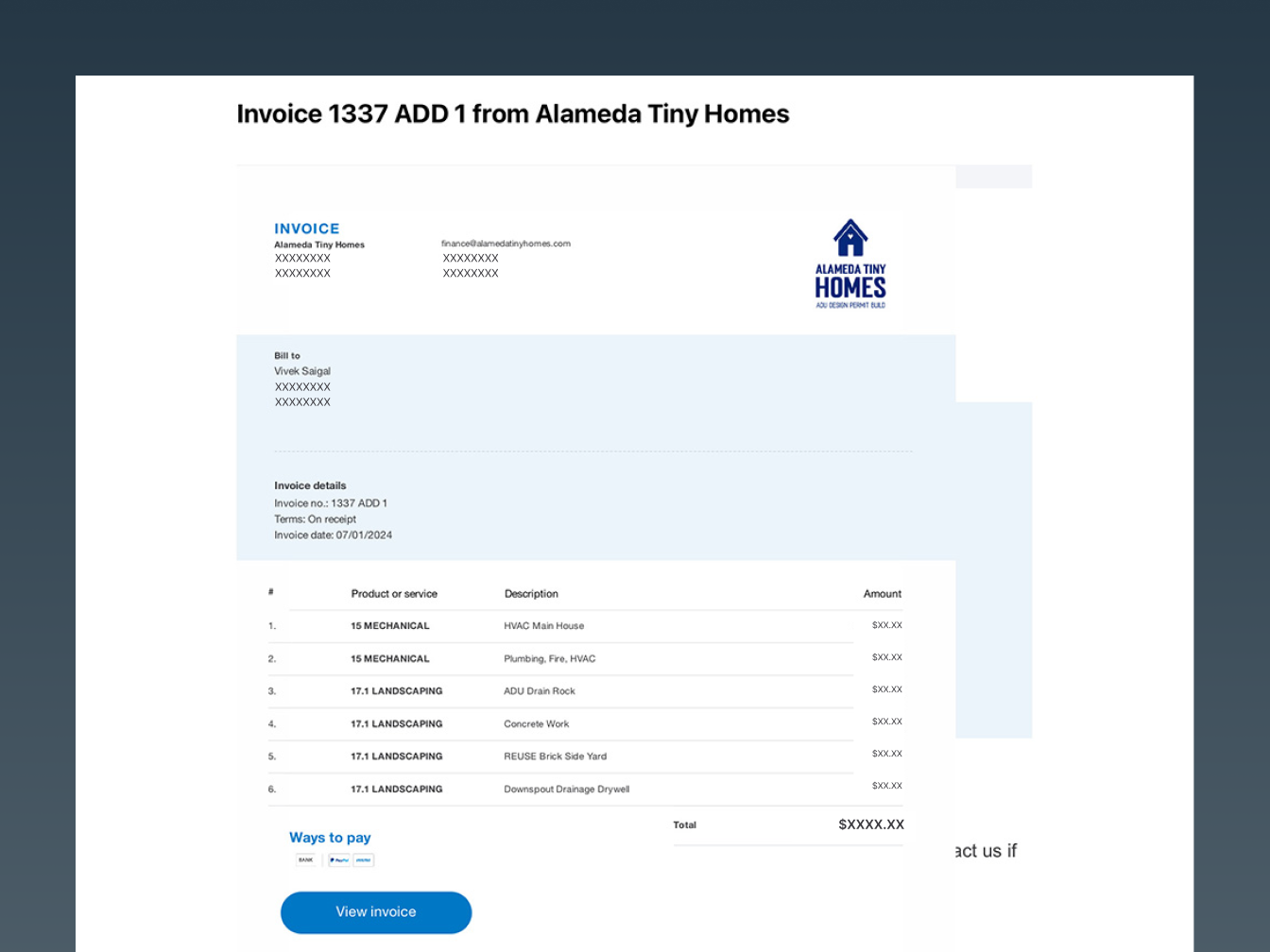
For customization, the design system didn't have what we needed. Our developers proposed reusing existing components in new ways, and I adjusted my designs to fit their idea. We were overruled: build new pieces now, and let the design system adopt them later. That never happened, and what shipped looks very little like what I handed off.
Reflections
On the tracker, my hunch wasn't enough. Our PM's language test was: a screenshot of cut-off German text changed leadership's mind. Now I look for proof before I push back.
Customization taught me the bigger lesson. When the design system doesn't fit the product, fix the system. Don't build around it.
I wasn't a systems designer yet. This project is why I moved to what became the design systems team.