How we built a best-in-class content design system
Make it consistent, easy to use, and document everything

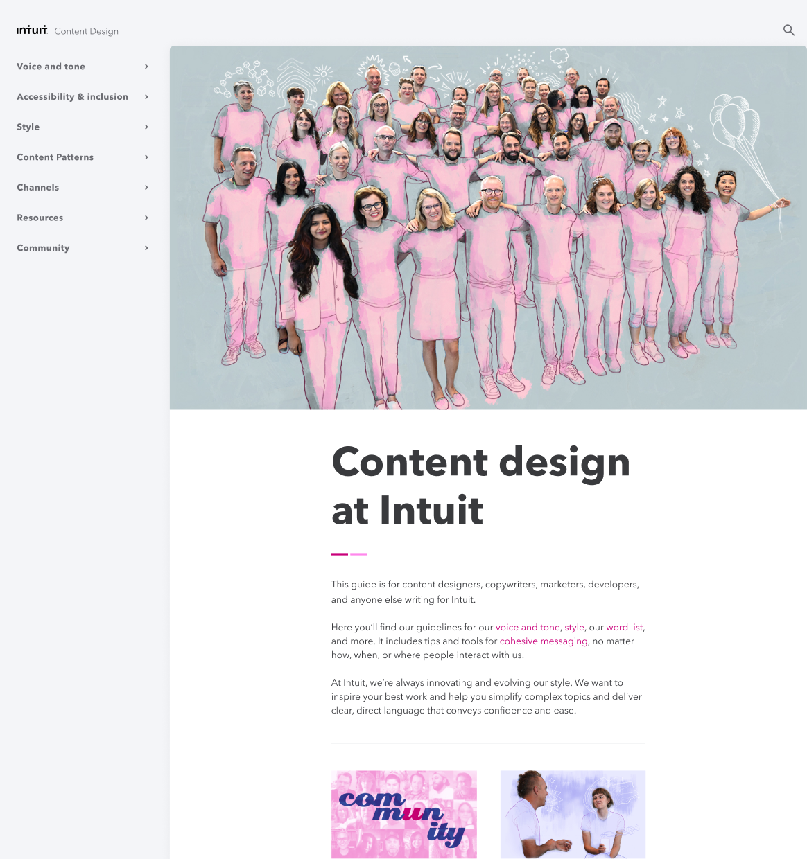
Content Community 2020

Content Community 2021
VIVEK SAIGAL
Content Community 2020
Content Community 2021
Customer problem
Content designers were stuck with 16 messy, inconsistent files for a design system. Without a reliable, unified resource for guidance, they struggled to deliver for Intuit’s customers.
Business needs
Enable teams to focus on delivering high-quality content. Reduce the time and effort required to create new content.
Goal
Create, grow and maintain a single source of truth website which lets content creators at Intuit do their work quickly and consistently.
Outcome
Three of us built a user-friendly, evolving design system that made it easy for designers to contribute. Guidance was robust and updated regularly. Figma components were documented and tested in code.
Then site traffic grew 140% year over year and the industry said we were awesome. ↓
We had existing guidance, but it wasn’t helping content designers deliver for our customers.
Content designers needed a single source of truth. They needed a resource that was consistent and comprehensive, that could scale and respond to their needs.
The closest thing we had to guidance was 16 scattered files across different teams. Each was incomplete and had its own internal logic. The one attempt to combine them produced a janky website that wasn’t much better than a Word doc.
Why didn’t we put it on Intuit’s design system?
We tried for over a year to move all the guidance to Intuit's main design site. However, the other team was reluctant to do so because the necessary infrastructure wasn't in place and would take more time to build. In the meantime, we advocated for a separate space until they were ready.

A sampling of components

High level documentation
We built a design system for the system
We created and maintained consistent and high-quality Figma components. The designs had to be easy to use as well as inclusive and accessible.
Documentation mattered as much as design
We documented what problem each component solved, its behavior, and usage rules. This future-proofed our work, making it easy for other designers to step in and contribute.
We made adoption easy
We made contribution and participation easy for designers which allowed the system to be updated often. People trusted and wanted to use the system because they were part of it. It’s a living document, not a set of laws.
It isn’t done until it’s expressed in code
I worked closely with my developer on design details and tested components to ensure they worked properly.
There was a lot of material to show, so how to make it digestible?
Visual design impacts perception. We wanted content to be more readable, scannable, findable — and beautiful. There’s no reason why a design system can’t be functional and nice to look at.
This wasn’t about creating pretty things, necessarily, but about designing a system that serves both customer needs and business objectives (speed, clarity, consistency, recruitment).

2018
Before the redesign
2020
First redesign
2021
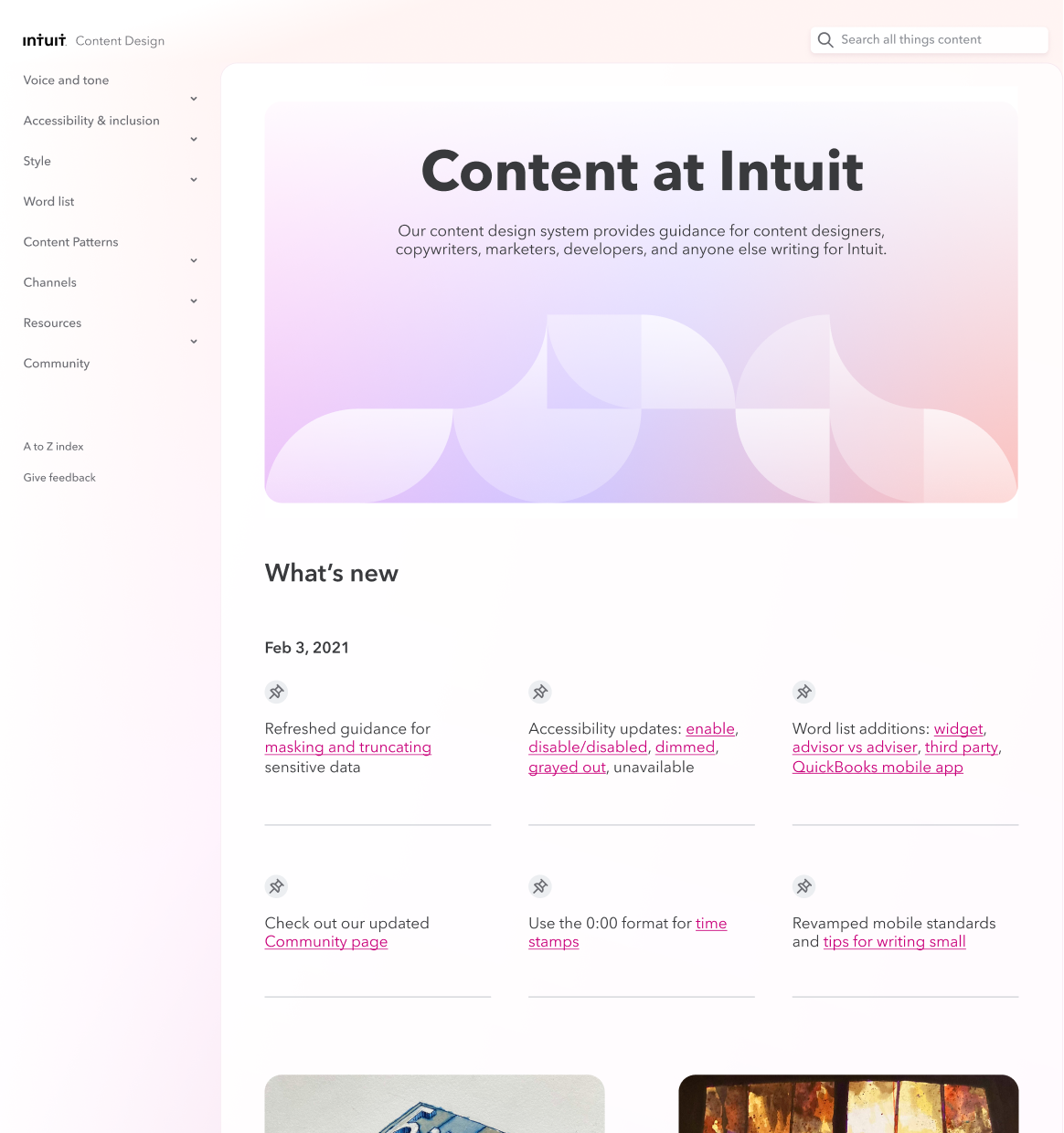
Second redesign

Table of contents

Robust search

Feedback cycle

404 page

Do/Don’t examples were a must
We added anti-racist language guidance
In 2021, we decided to add anti-racist guidance for content designers. To reinforce our message, I designed an animation to tell our story. I partnered with a motion designer and a developer to bring our vision to life. It's now one of the most-viewed site pages with 10,000 views in 2024.
It’s been cited as a best-in-class resource by organizations including Adobe, 18F, Nike, Northwestern Mutual, Zendesk, and Confab.
+ See the guidance
Before
A wall of text

After
Storytelling spotlights each section
New needs emerged, and we kept adding to the work we’d done. As the site evolved, so did the design.

Guidance for chatbot
Before: a wall of text. After: using visual context for clarity.

Design tokens
We adopted a systems approach to design elements like color.

Guidance for chatbot
Before: a wall of text. After: using visual context for clarity.

Recruitment link
We used the site to attract new talent to Intuit.
We knew the Content site would eventually need to merge with Intuit’s main design system site. We planned ahead and explored how that could work with a new visual identity.

Current state
Lots of opportunities for improvement.

Future state
An optimized reading flow, improved information hierarchy, and a one Intuit color palette.
Our design system is now used by thousands of employees in design, marketing, corporate and internal comms, learning & development, and customer success across the globe.
31% of users visiting the site are from other countries. We built a public-facing website to save time, but it also meant that the content design guidance was available to everyone.
Designers at other companies took notice:
“The Intuit content design system website is one of the best resources for content standards out there on the internet. I use it quite often for when I want to form an opinion or set a standard for product content I’m writing!”
Andy Welfle
Content leader and co-author of “Writing is Designing”
NNG said our system is a big deal:
“Intuit’s content standards were so comprehensive that they lived on a separate site.”
The industry also took notice. Check out the links to see what they said about us.
Teamwork gets it done
We were a small but mighty team of three—a content architect (Sarah), a developer (Kiran), and a designer (me).
And while there may have been three people “technically” working on this project, it was only possible to move quickly because of Tina O’Shea, Jennifer Schmich, and our content design community.
+ See the whole site: Contentdesign.intuit.com